
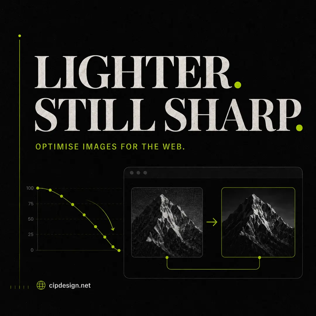
Images often carry the visual identity of a small business website, but they are also one of its heaviest components. The solution is not to remove every large photograph or compress it until it looks damaged. Good image optimisation keeps the visual impact while eliminating bytes the browser never needed.
Start with dimensions, not compression
A 4,000-pixel camera image displayed in a 700-pixel content column wastes bandwidth even if it has been compressed. Resize the source close to the largest size at which it will actually appear. Keep a separate original outside the website so future layouts are not limited by today’s export.
The free image resizer includes common web and social presets, or you can enter exact dimensions.
Choose the right format
JPEG remains practical for photographs, PNG is useful when transparency or very crisp flat graphics are essential, and WebP usually offers an efficient balance for modern websites. Logos and simple illustrations may be better as SVG when the source is genuinely vector.
Use the WebP converter to compare file sizes at different quality levels. If you receive a WebP file that another application cannot open, the WebP to JPG converter provides a quick reverse conversion.
Compress while looking at the image
There is no universal quality setting. A soft background photograph may tolerate stronger compression than packaging with small text or a portrait with fine hair detail. Reduce quality gradually and inspect the areas most likely to reveal artefacts: edges, gradients, shadows, skin and lettering.
The browser-based image compressor shows the saving before download, which makes it easier to choose a sensible compromise.
Use descriptive filenames and alternative text
Rename files before uploading. A name such as custom-oak-kitchen-iasi.webp is easier to manage than IMG_8472.webp. Filenames should be concise and truthful rather than packed with repeated keywords.
Alternative text describes the purpose or content of an informative image for people who cannot see it. Decorative images can usually have empty alt text. Do not turn every alt attribute into an SEO slogan; describe what matters in the context of the page.
Do not forget responsive delivery
A desktop hero image and a phone thumbnail should not require the same file. WordPress can generate multiple sizes and supply them through responsive image attributes, but only if the theme uses those features correctly. Check the actual file transferred in the browser, not just the dimensions shown on screen.
A repeatable five-minute workflow
- Crop for the intended composition.
- Resize to the maximum useful dimensions.
- Convert to the appropriate format.
- Compress while checking visual quality.
- Upload with a clear filename and purposeful alt text.
After updating the largest images, run the free website audit again. Compare page weight and performance with the original baseline. The best optimisation is measurable and visually invisible.