
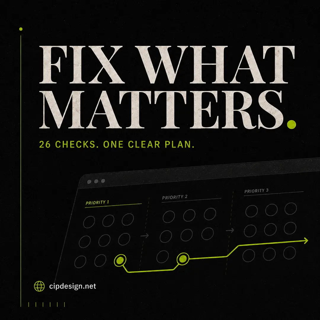
A website audit can produce dozens of observations. The difficult part is not finding issues; it is separating urgent problems from harmless imperfections. This checklist groups the work by impact so you can improve the page without turning the project into an endless redesign.
1. Can the page be reached and understood?
- The URL loads reliably over HTTPS.
- The page is not accidentally blocked from indexing.
- A canonical URL identifies the preferred version.
- The language and mobile viewport are declared correctly.
- The main content is available without depending on a fragile interaction.
If a page is inaccessible or sends conflicting indexing signals, address that before polishing copy or colours.
2. Does the search result make sense?
- The title is unique, specific and appropriately sized.
- The meta description explains the benefit and invites the right click.
- The URL slug is short and readable.
- Open Graph information is present for social sharing.
Use the free Google SERP preview to inspect the title and description by pixel width, and the meta tag generator to assemble the required tags.
3. Is the content structured clearly?
- There is one descriptive H1.
- H2 and H3 headings create a logical outline.
- The opening paragraph confirms that the visitor found the right page.
- Important questions receive direct answers.
- Internal links lead to relevant services, products or guides.
- Images include meaningful alternative text where needed.
Word count alone is not a quality measure. However, a page that barely explains the offer may struggle against competitors that answer price, process, suitability and common concerns.
4. Is the page unnecessarily heavy?
- Images are resized to their real display dimensions.
- Photographs are compressed and delivered in an efficient format.
- Decorative media does not delay the useful content.
- Server response time is reasonable.
- Unused scripts, fonts and plugins are limited.
The WebP converter, image compressor and image resizer cover the most common image problems directly in the browser.
5. Can everyone use it?
- Text and background colours have sufficient contrast.
- Links and buttons are identifiable and keyboard accessible.
- Form fields have visible labels.
- Text remains readable on a phone.
- Meaning is not communicated by colour alone.
Accessibility is not a decorative extra. It improves clarity for people using different devices, environments and abilities. Test colour pairs with the WCAG contrast checker.
6. Does the page inspire trust?
- Contact and business information is accurate.
- Policies are easy to find.
- Claims are specific and supportable.
- Forms explain what happens after submission.
- There are no obvious broken links or placeholder sections.
A simple priority system
Label each finding critical, high impact or refinement. Fix access, indexing and serious trust problems first. Then address speed, search snippets and content gaps. Leave cosmetic refinements until the page works reliably.
You can run the complete checklist automatically with the free 26-point website audit. Save the first result, make a focused set of changes and run it again to confirm what improved.